 Modern British Prints
 Hover over the painting to magnify (there may be an initial delay while the magnified image is loaded)
 SOLD
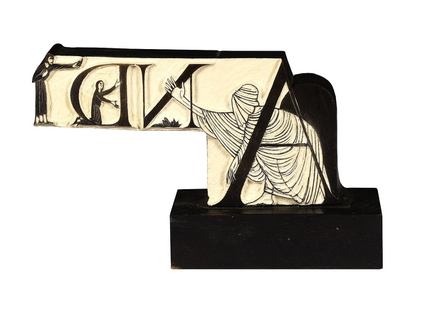
SOLDEric Gill (1882-1940):
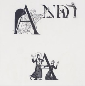
'And', Initial letters for The Four Gospels, Golden Cockeriel Press, 1931
Unframed (ref: 5223)
Physick 818 on a label to the base
The original block, 4 x 7 in. (10 x 17 cm.) including integral base.
See all works by Eric Gill woodblock Highlights of 20/21 Art Fair religion
Provenance: The Raising of Lazarus and St Thomas
Eric Gill greatly prized his woodblocks - he bought them back from the Golden Cockerel Press, ran gesso into them, carved them into silhouettes and mounted them on pedestals as free standing objects.
The Four Gospels, designed by The Golden Cockerel Press and with engravings by Eric Gill, printed as an edition of 500, was the culminating achievement of the private press movement. Robin Gartin, in British Printmakers 1855-1955, has described it as 'being among the greatest book productions between the Wars'
Robert Gibbings, the owner of The Golden Cockerel Press, was
responsible for setting the type, leaving appropriate spaces for which
Gill designed the initial letters and words. Leaves curl into the space
between paragraphs, swords hang down into the margin, and the symbols of
the evangelists each hold up the title of their gospel. It was a
marriage of image and text that recalls the best of medieval illuminated
manuscripts, yet is suited perfectly to the modern age and flawless in
its execution.
Experts on type and design have always been united in their praise of
Eric Gillïs typeface designs. Robert Harling spoke of the letters'character and beauty, discipline and gaiety, whilst Stanley Morison
said: The capitals that he did, I think, will be immortal. They'll be
used as long as the Roman alphabet is ever used anywhere. 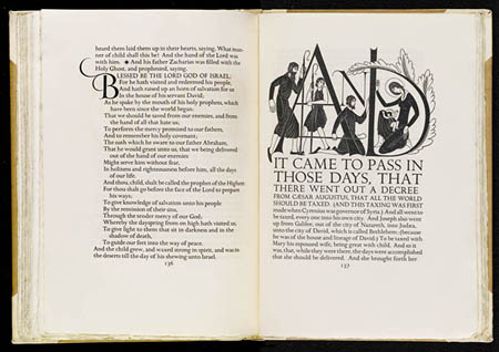
Letters are things, not pictures of things Eric Gill